Introduction: The Creator's Agonizing Color Dilemma
You're a modern creative professional, a digital artisan straddling two worlds. One moment, you're meticulously editing a stunning landscape photograph, destined for a large, gallery-quality print where every subtle hue of the sunset must be perfect. The next, you're exporting that same image for a client's website or your Instagram feed, where it will be viewed by millions on a vast array of screens.
And that's when the panic sets in. The vibrant cyans of the sky in your print proof look muted and dull on your phone. The rich, deep reds you perfected for the web look garishly oversaturated on a colleague's screen. This is the color management crossfire, a frustrating and costly battle fought daily by photographers, designers, and artists. The core of this conflict lies in two competing color languages: sRGB for the web and Adobe RGB for print.
With over a decade of hands-on experience calibrating and testing hundreds of professional displays, I've lived this problem. I've seen the costly reprints and the frustrating client revisions that stem from poor color management. The ultimate question is, can a single monitor truly serve as a Rosetta Stone, fluently speaking both languages and providing a reliable bridge between the digital and physical worlds? The answer is a resounding yes, but it requires the right technology and a precise workflow. This guide is my expert roadmap to achieving that one-monitor solution.
sRGB vs. Adobe RGB: Core Differences Explained
Before we can find a solution, we must understand the fundamental difference between these two color spaces. Think of a color space, or "gamut," as the total number of colors a device can display. It's like a box of crayons.
| Feature | sRGB (The Universal Language of the Web) | Adobe RGB (1998) (The Professional's Choice for Print) |
|---|---|---|
| Gamut Size | Smaller, the "standard crayon box" | Much larger (approx. 35% larger than sRGB), the "professional crayon box" |
| Primary Strength | Universal standard, ensures consistency across most devices | Displays more vibrant greens and cyans, covers the CMYK printing gamut |
| Primary Weakness | Cannot display many saturated colors captured by modern cameras | Not the web standard; will look flat and desaturated if uploaded directly |
| Core Use Case | All web content, online portfolios, social media | High-quality prints, professional photo editing, RAW file editing |
My Experience: For any work destined for the web, sRGB is non-negotiable. When I'm preparing an image for a fine art print, working in Adobe RGB is essential as it allows me to make precise adjustments to colors that simply don't exist in the sRGB space.
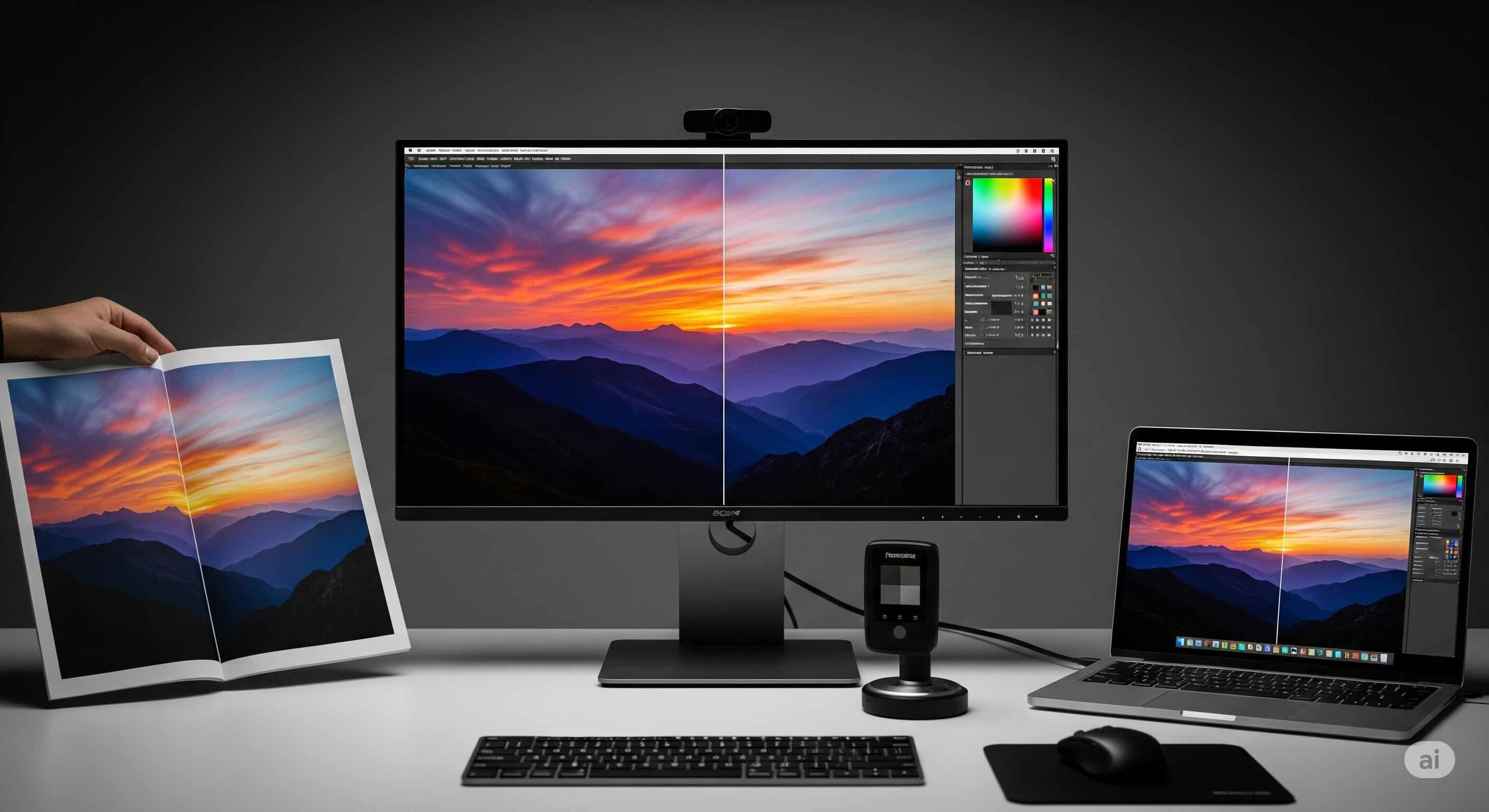
The One-Monitor Solution: Wide Gamut & Hardware Calibration
So, how do we reconcile these two worlds? You cannot make a standard sRGB monitor display the extra colors of Adobe RGB—the hardware simply isn't capable. Therefore, the only viable one-monitor solution is a wide-gamut monitor that can display at least 98-100% of the Adobe RGB color space.
However, owning a wide-gamut monitor is only half the solution. If you use it for web work without proper management, all your sRGB colors will look wildly oversaturated. This is where the most critical feature comes into play: sRGB Emulation Mode with Hardware Calibration.
Why sRGB Emulation is Your Most Important Feature
A high-quality professional monitor will have dedicated picture modes that can accurately "clamp" or restrict its wide gamut down to a smaller, standard space like sRGB. When this feature is combined with hardware calibration (using a device like a Calibrite or Datacolor colorimeter), you can create a perfectly accurate sRGB viewing environment on your wide-gamut display.
This gives you the best of both worlds:
- Native Mode: You can work in the monitor's full, wide-gamut glory, calibrated to Adobe RGB for your print-focused editing.
- sRGB Emulation Mode: With the press of a button, you can switch to a hardware-calibrated sRGB mode to accurately preview and edit how your work will appear on the web.
This ability to switch between verified, accurate color spaces on a single display is the cornerstone of a modern professional color workflow.
The Professional Color Management Workflow: From Calibration to Export
Having the right monitor is one thing; using it correctly is another. Here is the step-by-step workflow I use and recommend to every creative professional who needs to master both print and web.
Step 1: Choose the Right Professional Monitor
Your search should begin and end with wide-gamut IPS panels. Look for monitors specifically marketed to photographers and designers. The key specifications to demand are:
- Gamut Coverage: 99-100% Adobe RGB and 99-100% sRGB.
- Panel Type: IPS (or, for a higher budget, OLED).
- Hardware Calibration Support: The ability to store calibration data directly on the monitor's internal Look-Up Table (LUT).
- Uniformity: Excellent brightness and color uniformity across the entire screen.
For a curated list of top performers and a deeper dive into these specs, I highly recommend reading our comprehensive guide to the best monitors for photo editing.
Step 2: Invest in a Hardware Colorimeter
I cannot stress this enough: a professional monitor without a hardware colorimeter is an incomplete tool. All monitors drift in color and brightness over time. A colorimeter is a physical device that creates a custom correction profile, ensuring your monitor remains accurate.
For a full walkthrough, our professional guide to monitor calibration will take you through every step.
Step 3: Calibrate for Both Worlds
Using your colorimeter and the monitor's calibration software, you will create at least two calibrated profiles stored in the monitor's hardware:
- Profile 1 (Native Gamut): Calibrate the monitor to its full native gamut, targeting the Adobe RGB standard.
- Profile 2 (sRGB Emulation): Switch the monitor to its sRGB mode, then run another calibration targeting the sRGB standard.
Step 4: The Editing and Exporting Dance
With your monitor calibrated, your workflow becomes simple and predictable:
- Editing for Print: Work in your Adobe RGB calibrated mode. Set your editing application's working space to Adobe RGB.
- Exporting for Web: Switch your monitor to its sRGB emulation mode. In Photoshop, go to `Edit > Convert to Profile` and select sRGB. You will now see an accurate preview. Then use the `Export > Save for Web (Legacy)` function, ensuring "Convert to sRGB" is checked.
Step 5: Don't Forget a Final Panel Health Check
Even the most expensive professional monitors can arrive with flaws. Before you invest hours in calibration, run a few quick diagnostics. Use a full-screen Dead Pixel Test, a Backlight Bleed Test, and a general Color Test. Finding these problems within your return window is crucial.
Conclusion: One Monitor to Rule Them All
The color management crossfire between sRGB for web and Adobe RGB for print is a real challenge, but it is one that modern technology has definitively solved. A single monitor absolutely can be the master of both domains.
The solution is a specific type of tool: a wide-gamut display with near-perfect Adobe RGB coverage, and most importantly, the ability to accurately emulate the sRGB color space through hardware calibration. This allows you to work with the full, rich palette required for high-quality print, and then, with the flick of a switch, preview and prepare your work with absolute certainty for the sRGB world of the web.
Investing in this solution is an investment in efficiency, accuracy, and professional peace of mind. It eliminates the guesswork, prevents costly errors, and finally ensures that the color you so meticulously craft on your screen is the color your audience, and your clients, will see.