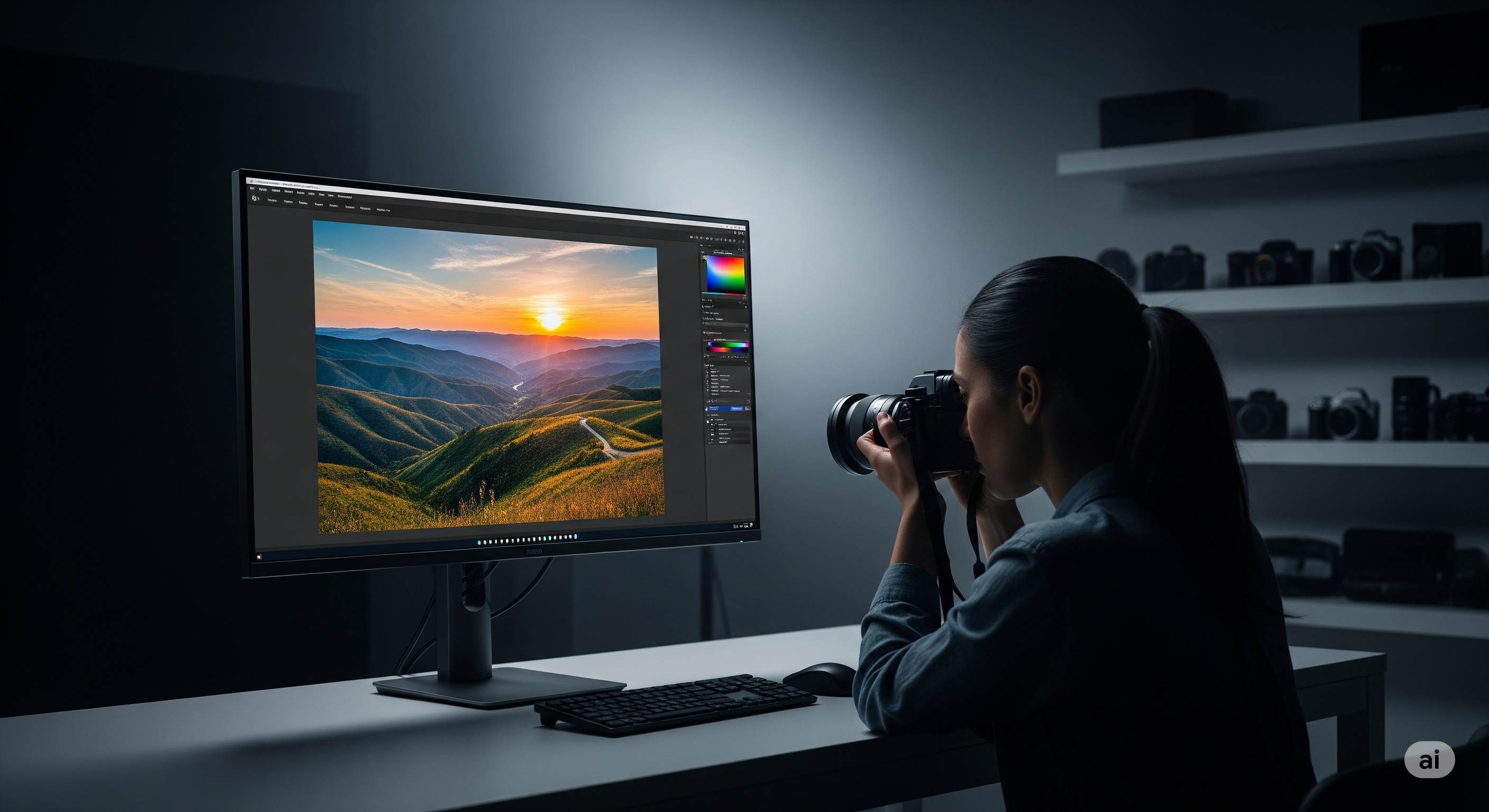
Introduction: The Frustrating Gap Between Your Screen and Reality
You’ve spent hours meticulously editing a photograph. The colors are vibrant, the tones are perfect, and the details are razor-sharp. You export it, send it to a client, or view it on your phone, only to be met with a horrifying realization: it looks completely different. The vibrant reds are now muddy, the subtle shadows are crushed into black, and the overall image is a pale imitation of the masterpiece on your screen.
If this scenario sounds familiar, you've encountered the most critical and often overlooked problem in a digital photographer's workflow. Your monitor is not just a window to your work; it is the foundation upon which every creative decision is built. Using a standard, uncalibrated display for serious photo editing is like trying to paint in the dark. You're guessing, not creating.
As display technology specialists, we understand that a great camera is only half the equation. This guide is designed to be your definitive resource for choosing the best monitor for photo editing. We will cut through the marketing jargon and delve into the core technologies that truly matter: color gamut, color accuracy, panel uniformity, and more. By the end, you'll not only understand what to look for but also how to verify that your new display is performing flawlessly, ensuring that what you see is truly what you get.
Why Your Monitor is the Most Critical Tool in Your Editing Workflow
In the realm of digital photography, the principle of "What You See Is What You Get" (WYSIWYG) is the ultimate goal. Your monitor is the single source of truth for color, contrast, and brightness. If that source is inaccurate, every adjustment you make is based on flawed information.
The consequences are significant. Editing on a consumer-grade monitor that oversaturates colors might lead you to desaturate an image, resulting in a dull, lifeless final product when viewed on a standard device. Conversely, a screen with poor contrast might cause you to over-brighten shadows, destroying subtle details. This leads to wasted hours, frustrating revisions, unhappy clients, and disappointing prints that don't match your creative intent.
Investing in a color-accurate monitor isn't a luxury; it's a fundamental requirement for anyone serious about photography. It ensures consistency across different devices and provides the confidence that your artistic vision will be faithfully translated from your screen to the final medium, be it a website, a social media post, or a gallery-quality print.
The Pillars of a Great Photo Editing Monitor: Key Features Explained
Navigating the spec sheets of modern monitors can be daunting. To simplify the process, we've broken down the most crucial features that directly impact image quality for photography. Prioritize these, and you'll be on the right path.
Color Gamut: Speaking the Language of Color (sRGB, Adobe RGB, DCI-P3)
A color gamut, or color space, is the specific range of colors a device can reproduce. For photographers, two gamuts are of paramount importance.
- sRGB: This is the standard color space for the web, most applications, and consumer devices. A monitor that can cover at least 99% of the sRGB gamut is the absolute minimum for any kind of creative work. It ensures that your photos will look correct to the vast majority of people viewing them online.
- Adobe RGB: This is the professional's choice, especially for print. The Adobe RGB color space is significantly larger than sRGB, particularly in the green and cyan spectrums. This wider gamut allows you to see and edit colors that are present in your camera's RAW files but are outside the range of sRGB. If you ever plan to print your work, a monitor with high Adobe RGB coverage (98% or more is ideal) is essential to accurately preview the final output.
- DCI-P3: While primarily a video standard for digital cinema, DCI-P3 is becoming more common in monitors. It's slightly larger than sRGB but smaller than Adobe RGB in key areas. While nice to have, for a pure photography workflow, Adobe RGB coverage remains the more important metric.
Once you have your monitor, you can get a visual sense of its color capabilities by running a comprehensive Color Test, which can help you spot issues like color banding and poor gradient handling.
Color Accuracy: The Delta E < 2 Mandate
Color accuracy is arguably even more important than color gamut. A wide gamut is useless if the colors within it are displayed incorrectly. Color accuracy is measured by a value called Delta E (dE), which quantifies the difference between the color signal sent to the monitor and the color it actually displays.
The key numbers to know are:
- Delta E > 3: The color difference is easily perceptible to the human eye.
- Delta E < 2: The difference is considered imperceptible for most people. This is the target for professional-grade accuracy.
- Delta E < 1: The difference is virtually undetectable. This is reference-grade performance.
Look for monitors that come with a factory calibration report in the box, guaranteeing a low average Delta E value out of the box. However, all monitors drift over time. For long-term accuracy, periodic recalibration with a hardware colorimeter (like a Calibrite or Datacolor Spyder) is non-negotiable. For a deep dive into this essential process, our professional guide to monitor calibration is a must-read.
Panel Technology: IPS is King for Photography
The underlying technology of the screen's panel has a massive impact on its suitability for photo editing.
- IPS (In-Plane Switching): This is the undisputed champion for photo editing. IPS panels are renowned for their superior color reproduction and, most critically, their excellent viewing angles. This means the colors and contrast remain consistent even when you view the screen from an angle, which is vital for collaborative work or simply shifting your posture.
- VA (Vertical Alignment): VA panels offer the best contrast ratios, producing deep, rich blacks. However, they typically suffer from off-axis color and gamma shift, making them less suitable for color-critical work where consistency is key.
- OLED / QD-OLED: The heir apparent. OLED technology offers per-pixel illumination, resulting in true blacks, infinite contrast, and instantaneous response times. While their color accuracy is superb, the primary concern for static work like photo editing has been the risk of burn-in. However, modern OLEDs have sophisticated mitigation features, making them an increasingly viable, albeit premium, option.
Screen Uniformity: Banishing Hotspots and Color Casts
Screen uniformity refers to the consistency of brightness and color across the entire surface of the display. A monitor with poor uniformity might be brighter in the center than at the edges, or have a slight color cast (e.g., a pinkish hue on one side and a greenish hue on the other). This is a disaster for editing, as it means a globally applied adjustment will have a different effect on different parts of your image.
High-end professional monitors often have built-in uniformity compensation technology. For any monitor, it's crucial to check for issues like "IPS glow" (a glow that appears in the corners when viewing dark scenes off-angle) and backlight bleed. You can easily check for these flaws in a dark room using a Backlight Bleed Test, which displays a black screen to make these issues more apparent.
Resolution and Size: Finding Your Sweet Spot
For photo editing, more detail is always better. A 4K (3840x2160) resolution monitor is the modern standard. It allows you to view your high-megapixel images at or near 100% magnification while still having room for your editing tools, providing a much clearer view of fine details and sharpness.
The ideal size is subjective, but the 27-inch to 32-inch range offers the best balance of screen real estate and pixel density for a 4K resolution. This size ensures that UI elements and text remain crisp and readable without excessive scaling. A sharp display is crucial for judging the quality of your images, and you can assess your monitor's ability to render fine details with a Text Clarity Test.
How to Test Your New Monitor: A Critical First Step
Once your new monitor arrives, don't just plug it in and assume it's perfect. Performing a few quick checks can save you from the headache of discovering a flaw after your return window has closed. This initial inspection is crucial.
- Check for Physical Defects: The very first thing you should do is check for dead or stuck pixels. These are tiny pixels that are permanently off (black) or stuck on a single color (red, green, or blue). Use our simple, full-screen Dead Pixel Test to cycle through solid colors, which makes any defective pixels stand out immediately.
- Understand the Defect: It's helpful to know what you're looking for. A dead pixel will remain black on all color screens, while a stuck pixel will show a specific color. To learn more about the differences and what they mean, read our detailed guide on dead pixels vs. stuck pixels.
- Assess Uniformity: As mentioned earlier, use a backlight bleed test in a dimly lit room to check for excessive glow or light leakage around the edges of the screen. Minor IPS glow is normal, but large, bright patches are a sign of a defective panel.
- Look at Gradients and Colors: View some high-quality, full-screen images with smooth gradients (like a sunset). Look for any signs of "banding," where the smooth transition of color is replaced by distinct, blocky steps. This can indicate a limitation in the monitor's bit depth or processing.
Conclusion: Investing in Confidence and Consistency
Choosing the best monitor for photo editing is an investment in your craft. It's about removing uncertainty and gaining the confidence that the colors you see on your screen are the colors you intended to capture. While the market is flooded with options, focusing on the core pillars of performance will always lead you to the right choice.
Prioritize a wide-gamut IPS panel with near-complete Adobe RGB coverage. Demand impeccable color accuracy, verified by a factory calibration report and maintained with your own colorimeter. Insist on excellent screen uniformity to ensure your edits are consistent from edge to edge. A 4K resolution on a 27 to 32-inch screen will provide the canvas you need to see every last detail.
By following this guide and rigorously testing any new display, you can equip yourself with a monitor that serves not as a barrier, but as a perfectly transparent window to your creative vision. You can finally stop guessing and start creating with the absolute certainty that your work will look exactly as it should, everywhere.